Pricing and Editions screenshot with eyetracking heatmap

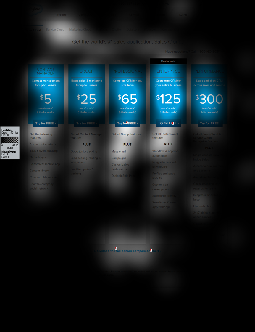
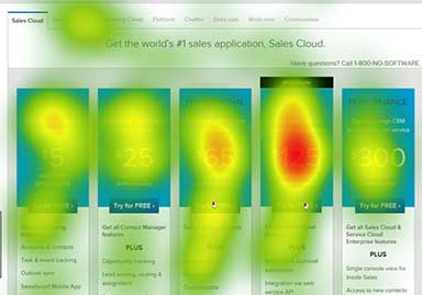
Salesforce Eye Tracking Study

Challenge:
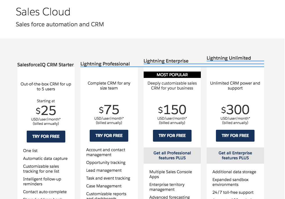
Salesforce.com has a Pricing and Editions page that confuses users with a plethora of choices. The problem is one of hierarchy, so we performed an eye tracking study to understand what users view as most important on the current page.

What we did

Process:

Our team of three spent a week performing an eye tracking study with seven participants.

1. User Interview

After recruiting seven users (3 potential users and 4 current users), we scheduled them for appointments, brought them into the lab, and interviewed them to understand what their level of product knowledge was.

2. Eyetracking

Next, we calibrated each user with the Mobii Eye Tracker and ran them through a few simple tasks. This vital takeway here is the user's eye movements across the page for first few seconds of each page display.

3. Synthesis

Finally, we took this dataset and synthesized it into a digestable and actionable presentation, including clear and actionable next steps to improve the visual hierarchy of the page.

Results:

The main deliverables here were the presentation, explaining our methods and our learnings. We found that users eyes immediately went to the large pricing numbers highlighted in the center of page, and essentially never examined the features of each pricing level found below in each column.

Pricing and Editions screenshot

Original Page

Here, you can see a full, unobstructed view of the page as it existed at the start of the project.

Pricing and Editions screenshot with eyetracking heatmap

What people see

The large blue pricing areas of each column draw the eye, to the point where it's all users really see.

Drawing of a person walking up a long staircase

Results

Our design reccomendations, with a clearer visual hierarchy, have been implemented on the live site.

Want to hire me? Get in touch!

Send me a message here, or look below to find me elsewhere on the tubes.