Thumbnail of a website concept

WellsFargo.com Redesign

Challenge:
Wells Fargo has been a trusted name in banking for over 160 years, and is now the largest bank in the world. They must constantly look ahead to remain relevant to consumers, and so they asked us to produce a forward-looking redesign of their homepage.
What we did

Process:

As always, it begins with building an understanding of our users.

1. User Research

We began by gathering research, insights, and strategy to understand the target audience. A major goal was to drive engagement directly on the site, which many users saw simply as a login portal.

2. Ideate

From there, I lead the team in ideating through various design concepts that the site could take. We narrowed down to three very different concepts, which I wireframed out, and worked with visual designers to flesh out.

3. Design/Test/Iterate

After designing three versions, we held workshops with Wells Fargo stakeholders to identify what was working, and what areas we could improve. Then, we tested the top two designs with users, and iterated.

Results:

We built and delivered two polished prototype visualizations of how the future site could look.

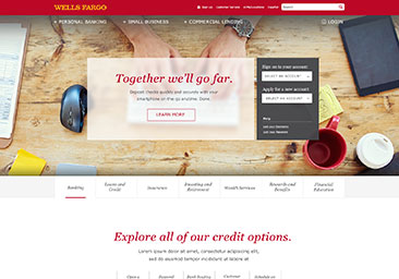
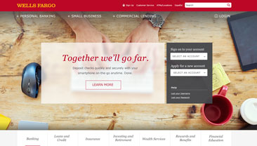
Thumbnail of a website concept

"Brand" Concept

This version was the closest to the current branding guidelines, making it the "safest", while still being a great improvement over the current site.

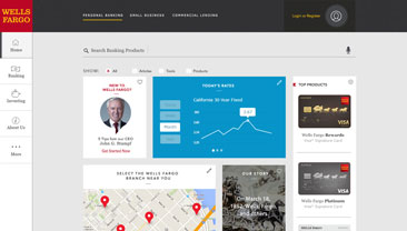
Thumbnail of a website concept

"Now" Concept

Here, we created a more dynamic, modular way of surfacing relevant content, with opportunity to show deep knowledge of the user's needs.

Drawing of a person walking up a long staircase

Next Steps

These concepts were circulated around as examples of future direction, and will serve as the basis for future design efforts.

Want to hire me? Get in touch!

Send me a message here, or look below to find me elsewhere on the tubes.